


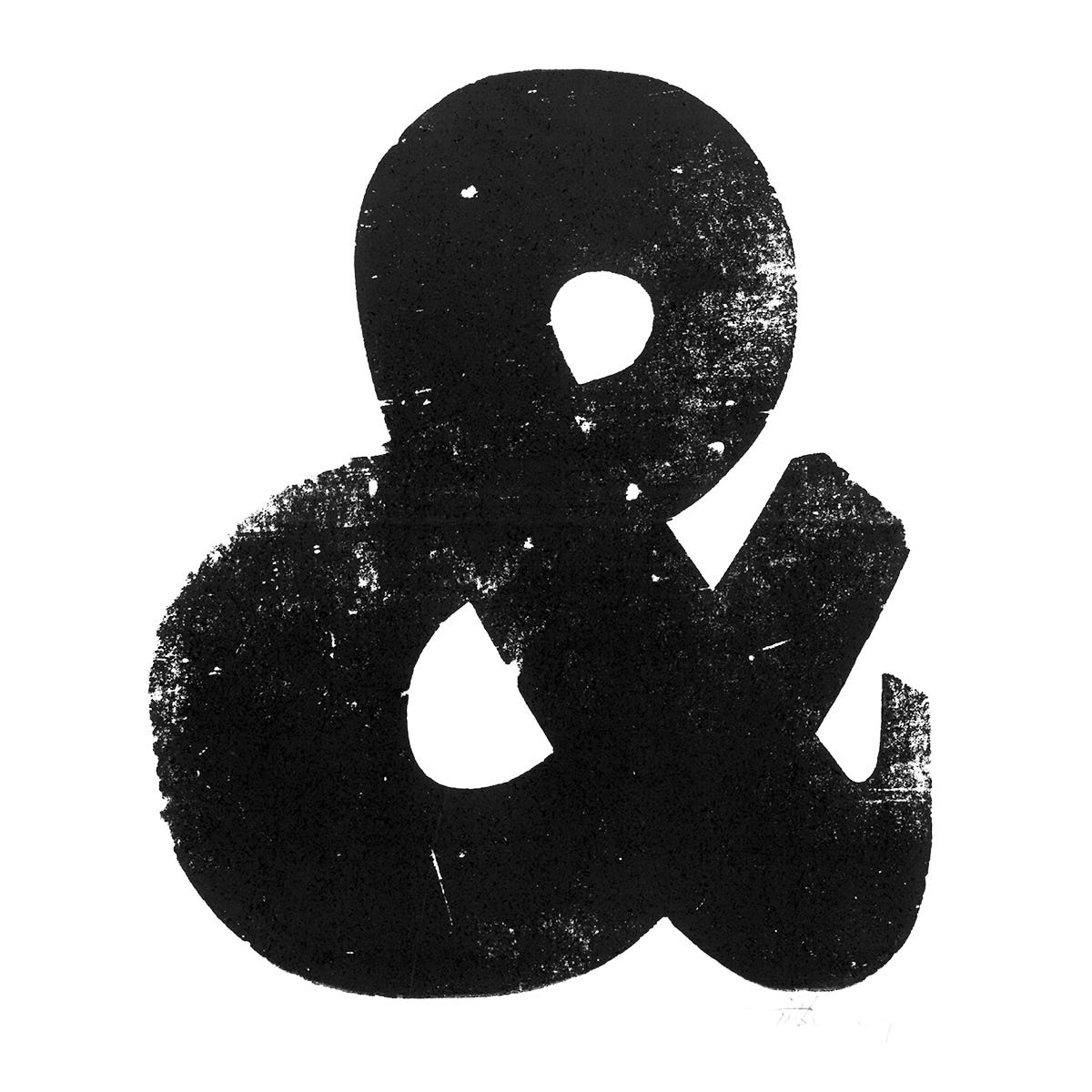
Do you use ampersands?
Considered a bit too casual by some, they are most commonly seen incorporated within business names, e.g. Johnson & Johnson, Barnes & Noble, Dolce & Gabbana.
So, where did this odd little symbol come from?
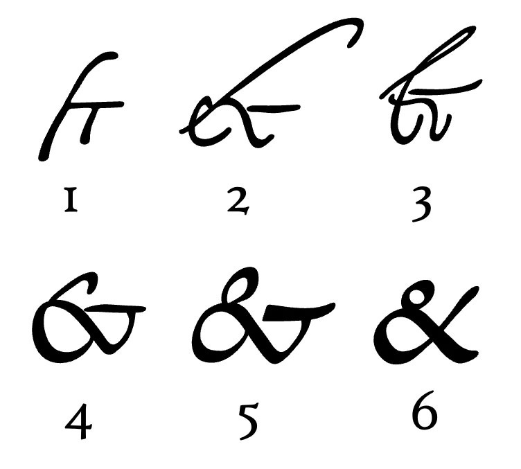
The ampersand symbol actually derives from the Latin word et, which means “and” something that the ampersand continues to signify today.
The symbol can be traced back to the 1st century CE and the old Roman cursive form of handwriting in which the letters E and T occasionally were written together to form a ligature (two or more letters joining together to form a single glyph). Over time the et ligature gradually became more stylised and less revealing of its origin. Having said this, certain versions of the ampersand clearly reveal the origin of the shape, e.g. Goudy Modern Italic.


That’s the story of the symbol. The word “ampersand” is another matter. It came along many years later when “&” was actually the 27th letter of the English alphabet.
In the early 1800s, school children reciting their ABCs concluded the alphabet with the &. It would have been confusing to say “X, Y, Z, and.” So the students said, “and per se and”. Per se means “by itself”, so the students were essentially saying, “X, Y, Z, and by itself and”. Over time, “and per se and” was slurred together into the word we use today: ampersand.
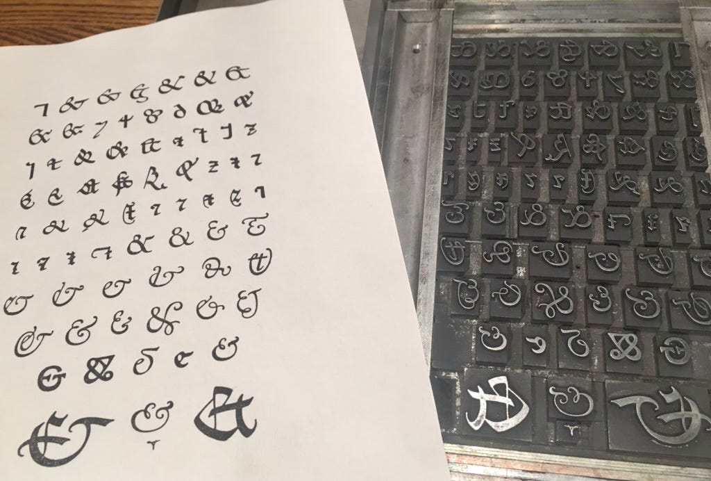
Finally, back to the symbol.
The ampersand is every typographer’s favourite ligature. It’s a sexy beast. Designer Chris Spooner has scoured the world’s font foundries to create a showcase of what he considers to be the most beautiful ampersands.
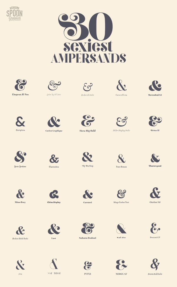
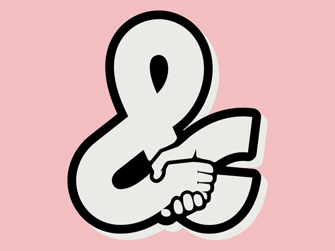
You can browse all 30 up close and personal, and read other posts about his beloved ampersand at blog.spoongraphics.co.uk.
Story Idea: Madeleine Rothery
REMORANDOM Chapter

Ampersand Merchandise at REMO
Matt Tilbury is a master printer and designer who's dedicated to the traditional art of letterpress printing. It's a craft that's changed little in over 500 years, since the dawn of printing. From his Sydney studio perched above the cliffs of Bondi, Matt utilises a large collection of wood and metal fonts to create beautiful typographic art.
Ampersand is one of The Tilbury Press designs available online at REMO HERE.

References
….. L♥️vE this and always really enjoy an Ampers&nd !
Wonderful! What about @