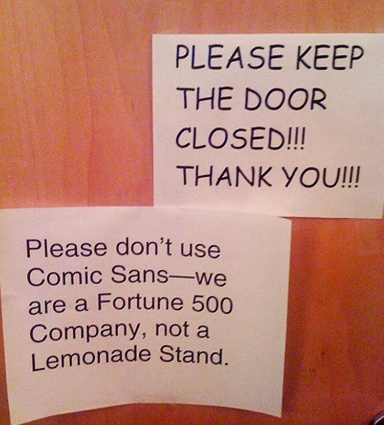
Comic Sans
The most hated font of all time
Behind every typeface there’s a story; and in the case of Comic Sans, that story involves: fame, celebrity, hate campaigns, designer manifestos and redemption.
Comic Sans is a non-connecting font with widely-spaced curvy letters, inspired by comic books like Watchmen and Batman: The Dark Knight Returns. It was designed by Vincent Connare to give written voice to Rover, a digital talking dog that appeared in something called “Microsoft Bob”; a software product intended to deliver a user-friendly interface. “Dogs don’t talk in Times New Roman.” said Connare at the time.
For technical reasons, Comic Sans never actually made it into Rover’s talk bubbles. It was however supplied initially as a supplemental font in the Windows 95 Microsoft Plus! Pack. Microsoft explained at the time that “this casual but legible face has proved very popular with a wide variety of people”.


So popular in fact that the typeface’s widespread use, often in less relaxed situations for which it was not intended, has been the subject of criticism and mockery.
In 2009 two Indianapolis graphic designers, Dave and Holly Combs, were so enraged by the squiggly font, maintaining that its use was often “analogous to showing up for a black tie event in a clown costume”, that they launched a campaign called “Ban Comic Sans” to eradicate its misuse. Their manifesto included these fightin’ words:
“By banding together to eradicate this font from the face of the earth we strive to ensure that future generations will be liberated from this epidemic and never suffer this scourge that is the plague of our time.”
Indeed, according to journalist Caitlin Dewey, writing in the Washington Post in 2014,
“Comic Sans is less a font than an Internet punchline. Anything written in the loopy, childlike type is ripe for derision, no matter what it describes: LeBron James’s defection from the Cleveland Cavaliers. The pope’s retirement. The existence of the Higgs boson.”
All real examples.


On the flipside, however, it’s important we take this comical font seriously, because many educators, especially in early education, see the benefits of Comic Sans, and in particular its high legibility. Additional advantages were noted for using Comic Sans, such as suitability for those diagnosed with dyslexia, and ease of mimicry to improve and model handwriting.
Liz Jackson, founder of disability-led design organisation The Disabled List is an unapologetic humourist about it all. In May 2019 she led #ComicSansTakeover at the AIGA Conference, a response to brands’ tendencies to take themselves way too seriously, especially in terms of disability design. It was a way to take back the meme and redeem the font.


Finally, in 2019 Dave Combs had a change of heart. He felt that the ban movement had attracted a lot of negativity, with people feeling justified in bullying those who used the font, and that the negativity of the ban had actually sparked a counter-movement feeling pity for the font. To him, the joke had gotten out of hand. He has gone so far as to change the name of his movement from “Ban Comic Sans” to “Use Comic Sans”.
Even so … haters still gonna hate. Where do you stand?
Videos
Check out YouTube for a rich selection of Comic Sans commentary. Here’s a taste:
Bonus Video for the Font Curious
After we posted Comic Sans we were reminded by subscriber Gordon Garb about this inspired video trilogy from Elle Cordova. Enjoy!
Related Podcast
REMORANDOM Chapter


