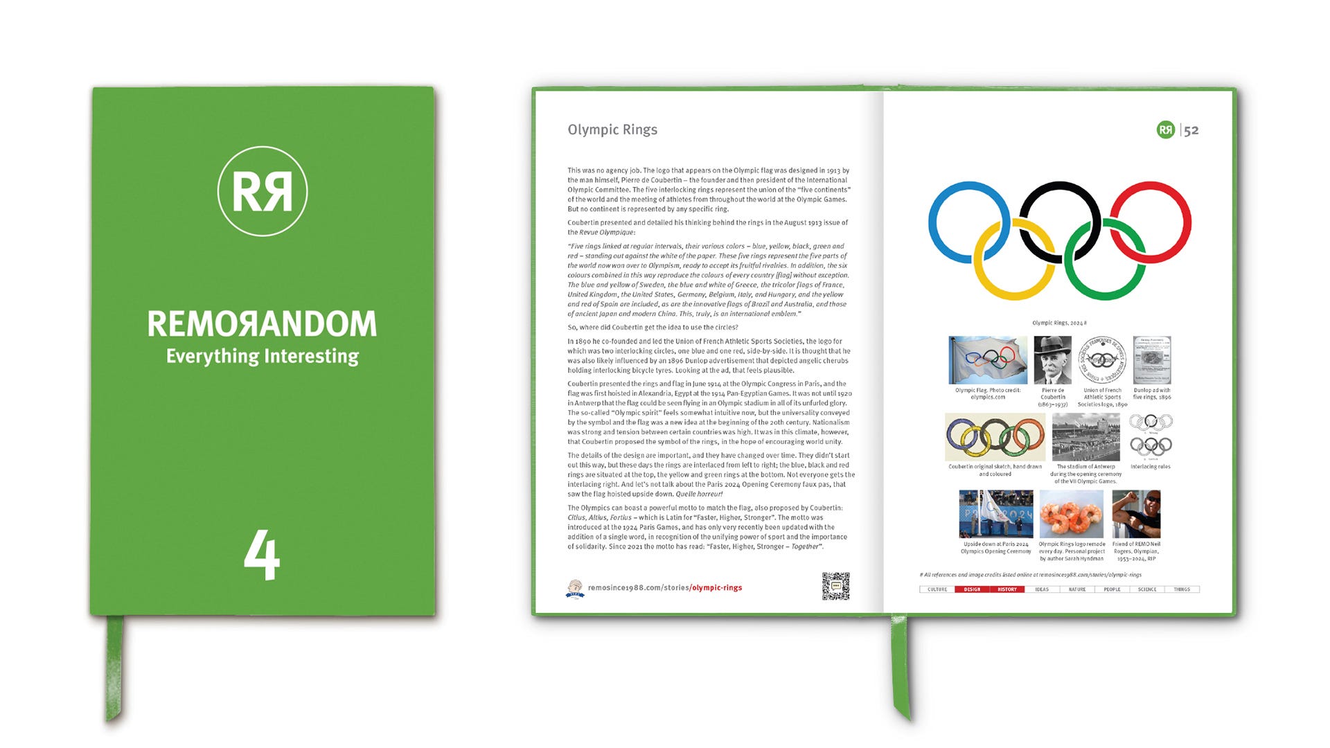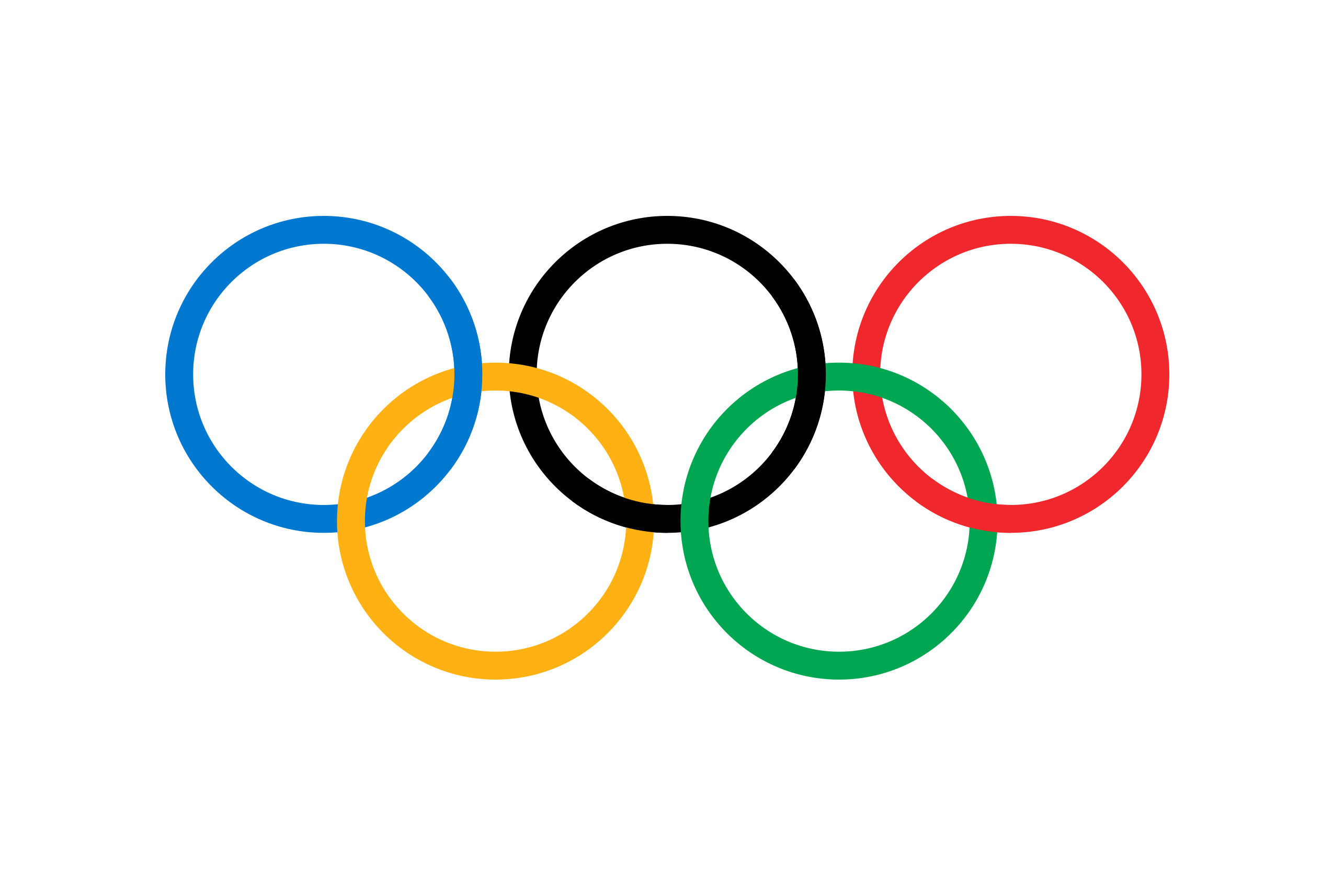
The five interlocking rings represent the union of the “five continents” of the world and the meeting of athletes from throughout the world at the Olympic Games. But no continent is represented by any specific ring.


Coubertin presented and detailed his thinking behind the rings in the August 1913 issue of the Revue Olympique:
“Five rings linked at regular intervals, their various colors – blue, yellow, black, green and red – standing out against the white of the paper. These five rings represent the five parts of the world now won over to Olympism, ready to accept its fruitful rivalries. In addition, the six colours combined in this way reproduce the colours of every country [flag] without exception. The blue and yellow of Sweden, the blue and white of Greece, the tricolor flags of France, United Kingdom, the United States, Germany, Belgium, Italy, and Hungary, and the yellow and red of Spain are included, as are the innovative flags of Brazil and Australia, and those of ancient Japan and modern China. This, truly, is an international emblem.”
So, where did Coubertin get the idea to use the circles?
In 1890 he co-founded and led the Union of French Athletic Sports Societies, the logo for which was two interlocking circles, one blue and one red, side-by-side. It is thought that he was also likely influenced by an 1896 Dunlop advertisement that depicted angelic cherubs holding interlocking bicycle tyres. Looking at the ad, that feels plausible.


Coubertin presented the rings and flag in June 1914 at the Olympic Congress in Paris, and the flag was first hoisted in Alexandria, Egypt at the 1914 Pan-Egyptian Games. It was not until 1920 in Antwerp that the flag could be seen flying in an Olympic stadium in all of its unfurled glory.
The so-called “Olympic spirit” feels somewhat intuitive now, but the universality conveyed by the symbol and the flag was a new idea at the beginning of the 20th century. Nationalism was strong and tension between certain countries was high. It was in this climate, however, that Coubertin proposed the symbol of the rings, in the hope of encouraging world unity.
The details of the design are important, and they have changed over time. They didn’t start out this way, but these days the rings are interlaced from left to right; the blue, black and red rings are situated at the top, the yellow and green rings at the bottom. Not everyone gets the interlacing right. And let’s not talk about the Paris 2024 Opening Ceremony faux pas, that saw the flag hoisted upside down. Quelle horreur!


The Olympics can boast a powerful motto to match the flag, also proposed by Coubertin: Citius, Altius, Fortius – which is Latin for “Faster, Higher, Stronger”. The motto was introduced at the 1924 Paris Games, and has only very recently been updated with the addition of a single word, in recognition of the unifying power of sport and the importance of solidarity. Since 2021 the motto has read: “Faster, Higher, Stronger – Together”.


REMORANDOM Book Chapter