PANTONE®
Who's responsible for this language of colour?
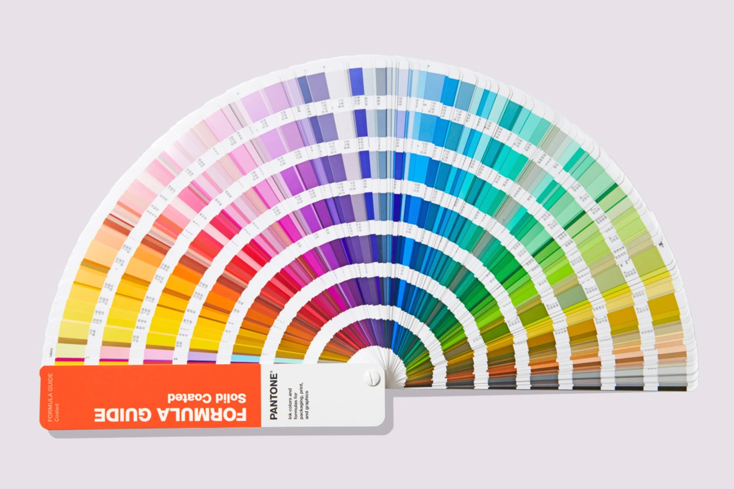
The PANTONE® Colour Matching System (PMS) was developed by Lawrence Herbert, who purchased what was originally a commercial printing company from its founders Mervin and Jesse Levine in 1962.
Herbert recognised the inconsistency and lack of standardisation in the world of colour. The system he developed assigned unique PMS codes to over a thousand standardised colours. It has become what it is today – the language of colour.


The company’s primary products include the Pantone Guides, which consist of a large number of skinny cardboard or plastic sheets, printed on one side with a series of related colour swatches and then bound into a small fan deck. For instance, a particular strip of swatches might contain several yellows of varying tints.
The idea behind the PMS is to allow designers and printers to colour match specific colours when a design enters the production stage, regardless of the equipment used to produce the colour. This system has been widely adopted by graphic designers and reproduction and printing houses. While Pantone doesn’t sell actual ink, it does specify how to mix the right proportions of the cyan, magenta, yellow and black inks (CMYK) to yield the vast majority of the listed colours.
For example, the cover of the REMORANDOM volume that this chapter features was specified to be printed Pantone Orange 021 C.


The human eye is very good at perceiving colour, and Pantone requires all of its workers to have perfect vision. All technicians take a yearly colour perception exam.
Colour is something to be celebrated. Since 2000, the Pantone Colour Institute has declared a particular colour to be “Colour of the Year”. The selected colour purportedly connects with the zeitgeist. This is all in contrast to the World’s Ugliest Colour [RR2:88].


Pantone not only leads the way in colour matching but has successfully turned Pantone into a consumer brand, offering a range of distinctive products from homewares through to stationery and fashion items. Pantone chip graduation caps or Pantone mugs anyone?


In another fun application, in 2012 Pantone developed a swatch book of skin tones so that photo retouchers could use it for colour correcting. It was also used in a collaboration with Sephora to help customers find the perfect shade of makeup. And, for a final dose of PMS dopamine, do check out the Human. project by Brazilian photographer Angélica Dass.
Postscript
The idea for colour matching is not new. The earliest recorded history of a colour library was by a Dutch artist known only as A. Boogert. In 1692 he wrote a book about mixing watercolours as a guide for artists, explaining how to create certain hues and change the tone by adding one, two or three parts of water. The final product is awesome in its scope. Check it out in its entirety on the website for Bibliothèque Méjanes in Aix-en-Provence HERE.
Story Idea: Lucia Giuffré
Videos
REMORANDOM Book Chapter


