Skeuomorphism
As a design ethos – is it dead or alive? Do you even know what it is?
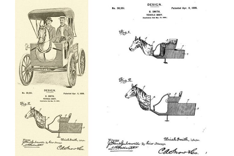
So, what’s a skeuomorph? To answer that, Wikipedia is a good place to start:
“A skeuomorph is a derivative object that retains ornamental design cues (attributes) from structures that were necessary in the original. Skeuomorphs are typically used to make something new feel familiar in an effort to speed understanding and acclimation.”
Here are some examples:
Electric light bulbs that imitate candle flames
The shopping cart icon
The wheel spokes/hubcaps of a car (needed on a wagon, but not on a car)
The sound of paper crumpling when you throw a file into your computer’s bin
A “floppy disk” symbol that you click to save on computers
The mechanical shutter sound on most phone camera apps
The notes app icon being represented by a graphic of a notebook


Automotive design has historically been full of physical skeuomorphisms. In The Design of Everyday Things, usability researcher and academic Don Norman notes that early automobiles were designed after horse-drawn carriages. Indeed, a patented early automobile design by Michigan inventor Uriah Smith called “Horsey Horseless” even included a wooden horse head on the front to try to minimise scaring the real animals. (The sharp eyed may have spotted one on the streets of London in the 2023 film Poor Things.)


An argument in favour of skeuomorphic design in digital devices is that it helps those familiar with the original item to learn to use the digital version thanks to cultural heritage.
Apple Inc., while under the direction of Steve Jobs, was known for its wide usage of skeuomorphic designs in various applications. This changed after Jobs’ death and when Scott Forstall, described as the most vocal and high-ranking proponent of the visual design style favoured by Jobs, resigned. Apple designer Jonathan Ive, who took over some of Forstall’s responsibilities, had made his distaste for the visual ornamentation in Apple’s mobile software known within the company. With the announcement of iOS 7 at WWDC in 2013, Apple officially shifted from skeuomorphism to a more simplified “flat” design, thus beginning the so-called “death of skeuomorphism” at Apple.
Flat design mandated that graphic user interfaces (GUIs) be freed from clutter. There was no need for bevelled edges, gradients, reflections and skeuomorphism. The interface should be exploited for its own strengths. Visual clarity was put at the forefront of design … as Ive explains online below or HERE.


But declarations regarding the death of skeuomorphism may have been somewhat premature. The arrival of the smart watch has signalled a skeuomorphism revival in which watch faces are designed to mimic the analogue watch experience, and indeed the form factor of the watch is itself skeuomorphic. It’s not actually a watch. It’s a computer that you wear on your wrist.
The lesson here? Design trends come and go … and everything, even skeuomorphism, should be taken in moderation.
Story Idea: Elizabeth Jigalin
Video
“Official iOS 7 Unveiling” by Jony Ive at Apple below or HERE


