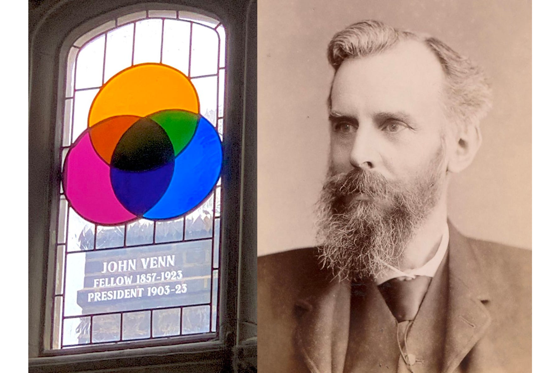
Venn Diagrams
Venn diagrams have become a popular vehicle for cultural observation or humour. Learn of their origin, and enjoy our selection of examples.

During a 20 June 2024 interview with TV personality Chrissy Teigen, the then US Vice President Kamala Harris said:
“I’m going to confess, I love Venn diagrams. You know – those three [circles]. If you’re ever in a moment of conflict, pull out a Venn diagram, they’ll just help you sort things out.”
With the exception of the Olympic Rings [RR4:52], Venn diagrams are our most recognisable overlapping circles. So what are they exactly?
Venn diagrams are widely used to visually communicate the logical relationship between data sets. The diagrams, very often using circles or ellipses, illustrate simple set relationships in the fields of probability, logic, statistics, linguistics, computer science – and, increasingly, popular culture.
Venn diagrams were introduced in 1880 by John Venn (1834–1923) in a paper entitled “On the Diagrammatic and Mechanical Representation of Propositions and Reasonings” in the Philosophical Magazine and Journal of Science. The existence of this genre of diagram predates Venn, but are justifiably associated with him as he was the one who really formalised their usage.
There is a common misconception about Venn diagrams that they can only be used to represent two or three sets when in reality one can represent any number of sets. Having said that, it can get pretty confusing as evidenced by some of our visual examples [Ed: I’m looking at you Steve Miller Band.] – and somewhat self-defeating given their original purpose to deliver visual clarity.
Venn diagrams have also become a popular vehicle for cultural observation or humour.
Enjoy our selection of examples.


REMORANDOM Book Chapter
