


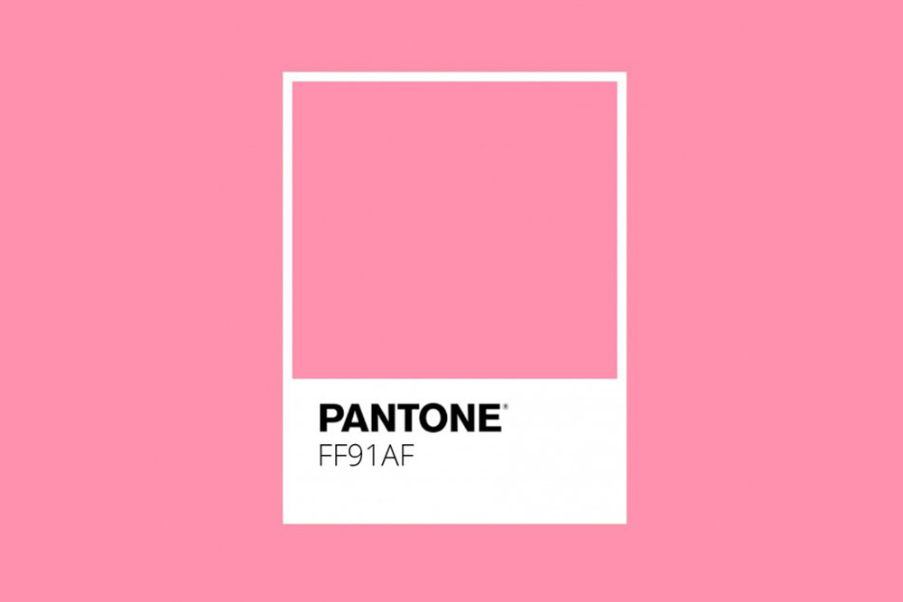
In the late 1970s, two American researchers, Alexander Schauss and John Ott, proposed an unusual solution to aggressive behaviour: the colour pink. Specifically, a vivid shade of bubblegum pink that came to be known as “Baker-Miller Pink”, named after the directors of a naval correctional facility in Seattle where the experiment took place. Holding cells were painted this precise hue, and early observations suggested a remarkable effect: reduced aggression, lowered heart rate, even decreased muscle strength. It seemed that this particular pink could pacify violent inmates – at least for a while.
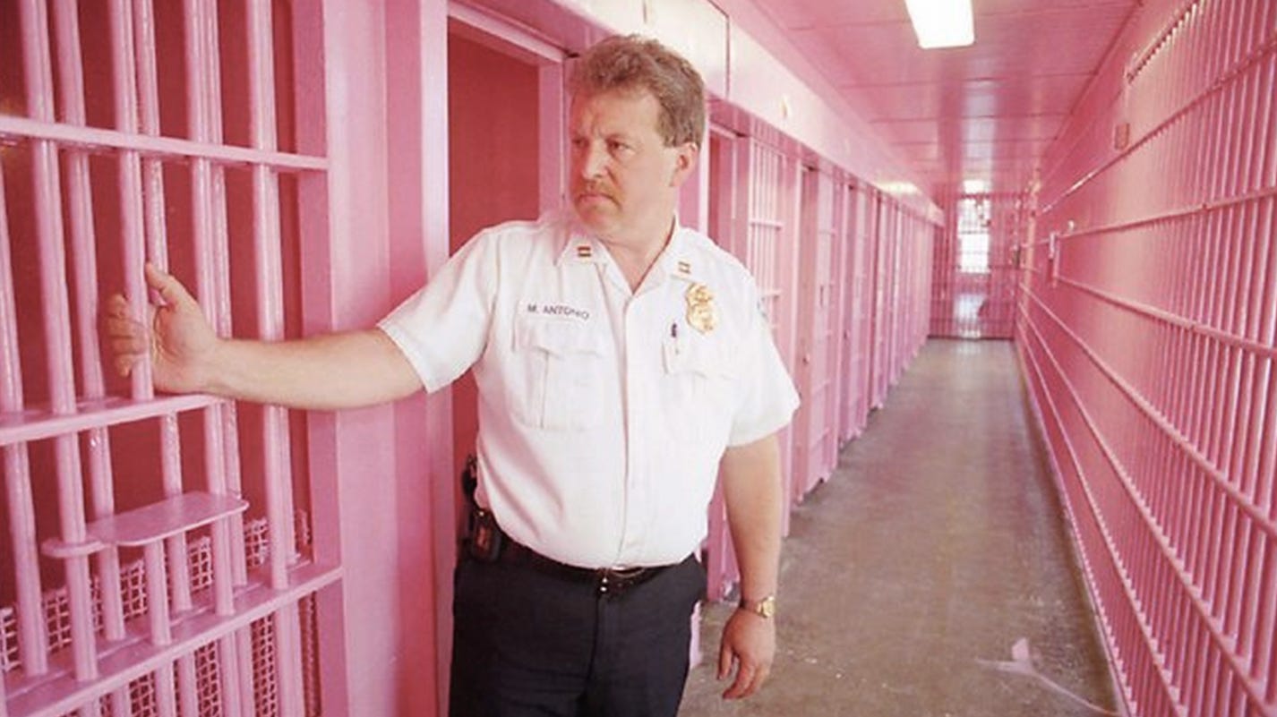


The media dubbed it “drunk tank pink”, and the idea spread. Locker rooms were painted pink in hopes of sapping the strength of opposing teams. School hallways and hospital wards took on the hue in pursuit of calm.
But follow-up studies were inconclusive. Some found no measurable effect at all. Others noted that any pacifying power wore off quickly, or perhaps reflected the novelty rather than the colour itself.
Still, the myth persisted, tapping into something long felt but rarely articulated: that colour changes mood, and few colours carry more emotional and cultural baggage than pink.


Pink
Pink, (named after the Dianthus plumarius flower), is a colour with many associations. In nature, it appears rarely and often temporarily – sunsets, cherry blossoms, flamingos (whose colour, interestingly, comes from the shrimp that they eat).
In culture, however, it’s omnipresent and deeply coded. In 18th-century Europe, pink was fashionable and worn by men and women alike. It wasn’t until the mid-20th century that pink became tethered to femininity – and that wasn’t organic. It was marketing. By the 1940s, retailers and manufacturers began pushing pink for girls and blue for boys, flipping earlier associations. Indeed, in 1918 the Ladies’ Home Journal said:
“The generally accepted rule is pink for the boy and blue for the girl. The reason is that pink, being a more decided and stronger color, is more suitable for the boy, while blue, which is more delicate and dainty, is pertier [sic] for the girl.”
The postwar consumer boom cemented the flipped association – with toys, clothes, and even personality traits colour-coded along gender lines: blue for boys, and pink for girls. The Barbie doll – launched in 1959 in a swirl of hot pink packaging – only strengthened the link.


But pink has also been a colour of resistance. In the 1970s and ’80s, punk fashion embraced shocking pink as a form of rebellion. The LGBTQ+ movement reclaimed the pink triangle – used by the Nazis to identify homosexual prisoners – and transformed it into a symbol of pride and defiance. More recently, protest movements like the Women’s March have wielded pink knitted “pussyhats” to confront regressive politics with defiant softness.
And then along came “millennial pink” – a dusty, desaturated version that emerged in the 2010s and blanketed everything from tech product packaging to cafe interiors. Gender-neutral, Instagram-friendly, and vaguely nostalgic, this new pink stripped away the drama and left something calm, palatable, even aspirational.


So, was drunk tank pink ever real? Maybe not in the way that was first believed. But as a symbol, the colour remains both intriguing and powerful.
REMORANDOM 6 is coming in May
I would have thought pink would be very aggravating for very aggressive males, but who am I to say?
Makes me wonder how the green room phenomenon arose as a way to calm nervous guests on TV given this colour it diametrically opposite pink/red hues.